Marketing
April 22, 2025
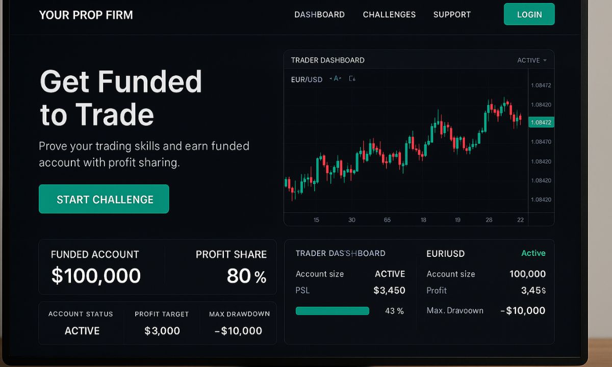
The 5 Must-Have Features for a High-Converting Prop Firm Website

First Impressions Matter: Build Trust Instantly
Traders make decisions fast. They land on your website, and within seconds, they decide—stay or leave. Sign up or move on.
And here’s the hard truth: if your website looks outdated, confusing, or even slightly untrustworthy, you’ve already lost them.
A modern, professional design is the first step. But good looks alone won’t convince traders to trust you with their capital. They need proof. Real proof.
One of the best ways to build credibility? Show your payout certificates. If traders see actual proof of withdrawals, they know your firm isn’t just making promises—it’s delivering results.
Another major trust signal? Your Trustpilot rating. If traders see a 4.5-star rating—or higher—along with dozens or even hundreds of positive reviews, they’re going to feel a lot more confident about signing up.
And don’t forget security. Traders want to know their data and funds are safe. So, highlight your security measures. Show them you take compliance and protection seriously.
If your website doesn’t immediately communicate trust, nothing else matters. Because a trader who doesn’t trust you… won’t trade with you.
Traders Don’t Trust Marketing—They Trust Other Traders
Let’s be real. Traders don’t trust marketing. They trust other traders.
That’s why social proof is one of the most powerful tools you can have on your website. If potential traders see real people getting funded, making withdrawals, and growing their accounts, they start to believe they can do it too.
Testimonials are great, but written reviews alone aren’t enough. Video testimonials? Now that’s powerful.
Imagine a trader explaining—on camera—how they passed a challenge, got funded, and successfully withdrew their profits. That’s way more convincing than any ad or sales pitch.
Another great way to create momentum? Show live trader activity.
A leaderboard. A “recently funded” section. A rolling feed of successful withdrawals. These things create a sense of movement, of activity.
When traders see others winning, they start thinking, “If they did it… maybe I can too.”
And that feeling? That’s what pushes them to sign up.
Make It Obvious Why You’re Better
Why should a trader choose your firm over the competition?
If your website doesn’t answer that question instantly… you’re already behind.
A high-converting prop firm website makes the decision easy. And one of the best ways to do that? A simple, side-by-side comparison.
Instead of letting traders research your competitors on their own, show them exactly how you stack up.
Are your fees lower?
Do you offer a better profit split?
Are your payout times faster?
Whatever your competitive edge is, put it front and center. Make it obvious.
A well-designed comparison chart, right there on your homepage, can be a game-changer.
Traders won’t have to guess who offers the best deal. They’ll see it for themselves.
And once they do? The decision becomes easy.
Speed and Simplicity Win Every Time
Here’s where a lot of firms get it wrong: A prop firm website should never feel like a puzzle.
If traders have to click through multiple pages just to find basic information… they’re gone.
Simplicity wins.
Your homepage should tell them everything they need to know at a glance:
Account options
Fees
Payout rules
It should all be instantly accessible.
And just as important? Speed.
If your website takes forever to load, you’re losing potential traders. Every second of delay increases the chances they’ll move on.
And let’s not forget mobile users. A huge percentage of traders browse on their phones.
If your site isn’t optimized for mobile—if buttons are too small, text is hard to read, or pages take too long to load—you’re driving people away.
A smooth, fast, and frustration-free experience isn’t optional.
It’s what separates firms that convert from firms that struggle.
A Call-to-Action That Actually Works
Even if your website is perfect—
Trust-building design? Check.
Strong social proof? Check.
Clear competitive advantages? Check.
Seamless experience? Check.
…traders still need that final push.
A reason to take action right now.
A high-converting prop firm website doesn’t just sit there, hoping traders sign up. It actively guides them toward it.
Your call-to-action needs to be clear, compelling, and impossible to ignore.
“Start Your Challenge Today.”
“Get Funded Now.”
“Join Thousands of Successful Traders.”
These aren’t just words. They’re the final nudge that turns interest into action.
And placement matters. Big time.
Your CTA should be visible as soon as traders land on your site.
And it should be repeated throughout the page—so no matter where they scroll, they always know what to do next.
The Bottom Line
A high-converting prop firm website isn’t just about looking good.
It’s about converting traders.
And to do that, it needs to:
Build trust instantly
Show real success through social proof
Highlight your competitive edge clearly
Make the experience seamless—fast, simple, and frustration-free
Guide traders toward action with a strong call-to-action
If your website isn’t doing all these things… you’re losing leads.
And every lost lead? Is lost revenue.
Need expert help? GrowYourPropFirm specializes in website development, SEO, digital marketing, and everything else prop firms need to scale fast.
Don’t leave conversions to chance.
Work with the experts who know exactly what traders are looking for.
Want a website that actually works?
Visit GrowYourPropFirm today.
About The Author
GrowYourPropFirms Team
At GrowYourPropFirm, we craft marketing strategies tailored for proprietary trading firms. We help boost visibility, attract skilled traders, and drive scalable growth. From new launches to established firms, our approach blends performance, branding, and funnels. We’re not just marketers — we’re your growth partners in the prop trading space.
Recent Posts